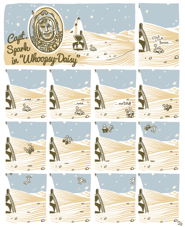
Tuesday, April 30, 2013
Monday, April 8, 2013
Salted Creamery

Last week I got a delivery of ice cream from the fine folks of Salted Creamery. I designed their logo and finally got to taste the product. It's super good. It makes you remember why you eat ice cream. It's the vanilla of my dreams. The ingredients are words you use every day and it's a nice demonstration of how wonderful complexity can come from simplicity. Like this butterscotch. I always liked the idea of butterscotch, but I never liked the flavor that came out of the squeeze bottle. It's hard to even describe; sweet and odd, but not something you'd want in your mouth. Unnatural, I guess. Since we started making it ourselves I basically put butterscotch on everything.
I'm very happy with how this turned out. They had a definite idea in mind, I explored some other directions, and through the design process we made something that fits them. I think it nicely visualizes the simple elegance of their product. And I got some ice cream.

Monday, April 1, 2013
A girl, her dog, and my background
Here's a story of me not doing what I know I should do even though I like, even love, doing what I should do, nevertheless failing to do it until the very end.
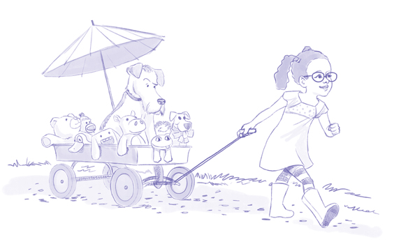
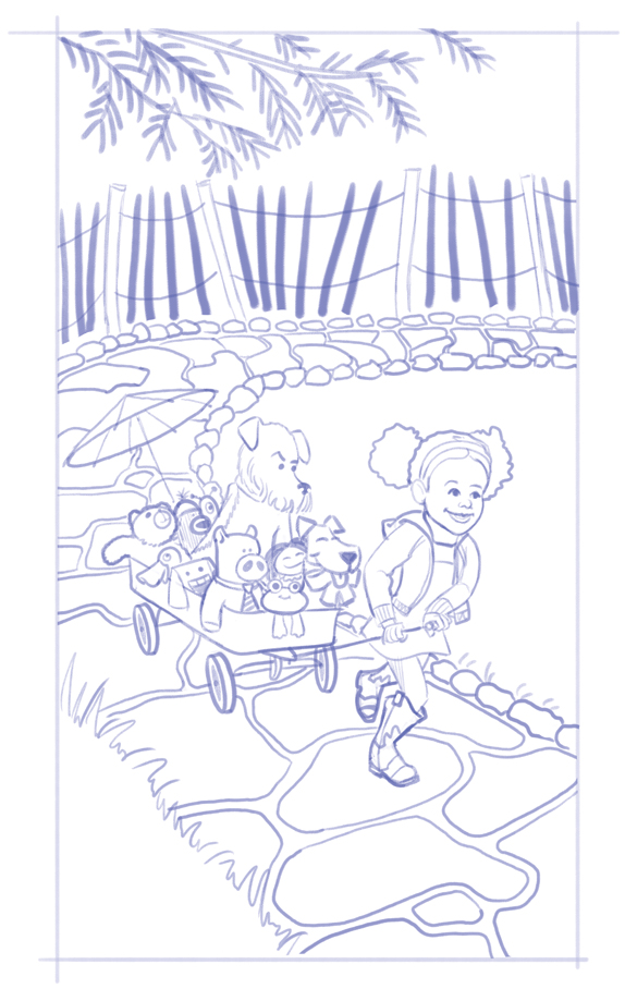
Last year I started a few drawings focusing on younger children and came up with the sketch above. While I was happy with the characters (cursing under my breath that the dog looked a bit too much like the dog from Mark Teague's fantastic Dear Mrs. LaRue books), I didn't spend any time on the background, but I figured I'd figure that out as I went along. You see, I’ve done this before, and it's the kind of thing that doesn't work, yet I treat it like an idea that just might work this time.
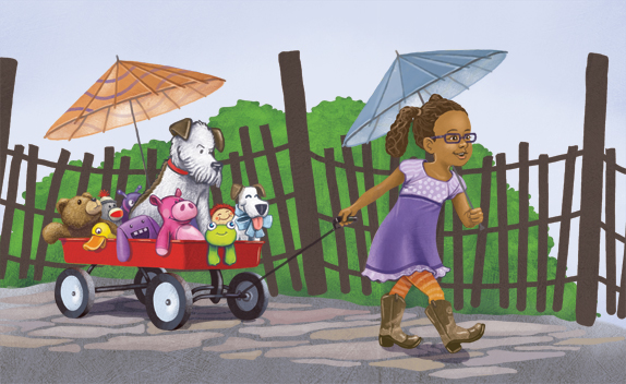
I came up with the stones, which I liked the fence, which I liked, and the bush, which I didn’t like, but would hopefully take up as much space as it could. I hated it. I spent a lot of energy both trying to make it work and trying to avoid working on it. The fence made weird tangents with the main characters, and it made the bush hard to see. The bush was such an obvious I'm-avoiding-the-background-item (which is nearly symmetrical and fits the space a little too well) that it’s hard to look at. Everything was flat and static. There was no movement or life or energy to the piece.
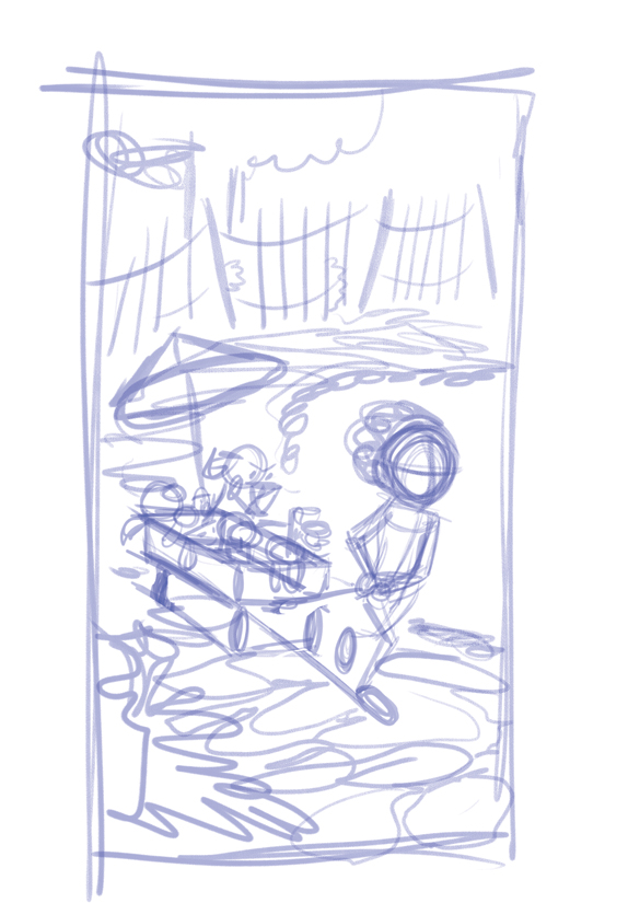
It's hard to start over, but I did a quick sketch. And this time, I was conscious about the piece as a whole.
The characters were moving, the space was moving, I spent time thinking about the background, and I placed things fairly effectively. A problem with the viewpoint of the first sketch was everything was on top of each other creating weird overlaps and tangents that distracted from the elements themselves. So I was pretty stoked about this. I still didn't answer all the questions about what would happen in the background (i.e. what happens beyond the fence?) but I figured I'd figure that out as I went along. You see, I’ve done this before, and it's the kind of thing that doesn't work, yet I treat it like an idea that just might work this time.
So I painted it again. And again I hated it. I don't even have it to show you because I trashed it. Looking back at the sketch, which is like the blueprint of the house, I realized that once again I phoned the background in, and I would be unhappy with this until I fixed it. Now this was a personal piece, so I could have just let it go, but I really liked the concept and the characters, and I really wanted to figure it out. I'm not an illustrator if I can't figure this out, right?
What I realized was figuring it out was more fun than it hurt to start over again. I also remembered Scott McCloud talking about backgrounds in his book Making Comics, part of his amazing and inspiring trilogy of books about comics and art and life, the universe and everything. He says:
There's more, and of course it's even more amazing and clearer to understand with McCloud's images, but I went back to the drawing board, and spent as much time on the environment as I needed to. I studied how other artists handled environments, Miyazaki films, nature ( a broad subject to be sure, but I'm about halfway done) and my copy of The Artistic Anatomy of Trees by Rex Vicat Cole, which I've had for years, but never picked up.
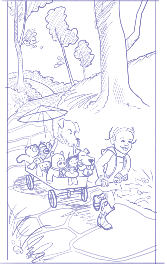
The background was now something I was excited about. The environment had movement and depth (something lacking in the last sketch). Did growing up in the flattest part of Kansas makes me default to flat boring environments?
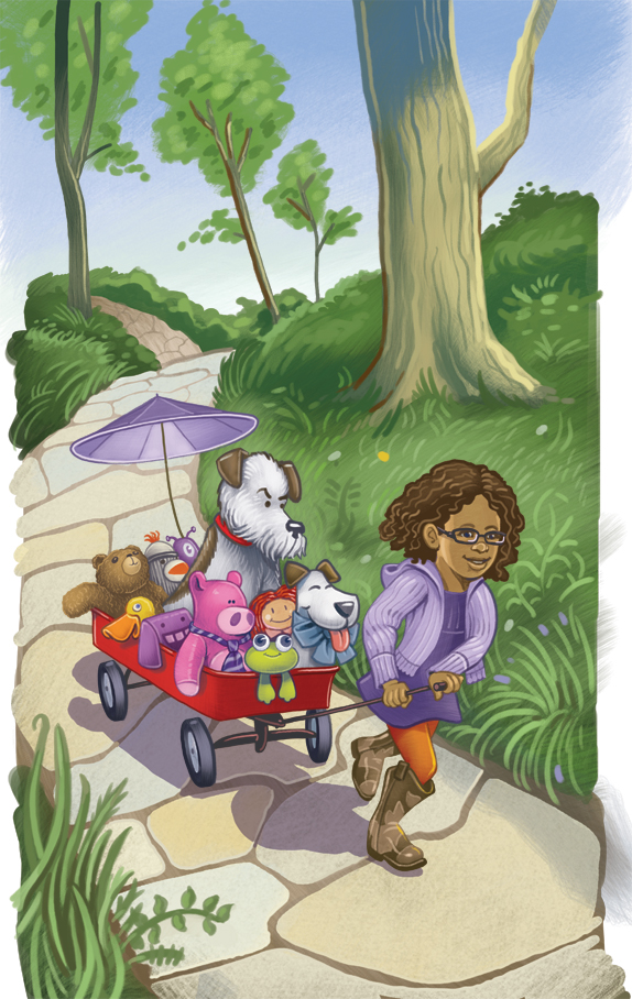
This went very fast now. I'd challenged myself instead of relying on the standard, and it made for a better piece, and it was exciting to work on. The final is here. It amazes me that I put so much energy into certain areas of my life, yet I still find a way to rob myself dong the things I love. Ah, well. I learned a lesson.

Last year I started a few drawings focusing on younger children and came up with the sketch above. While I was happy with the characters (cursing under my breath that the dog looked a bit too much like the dog from Mark Teague's fantastic Dear Mrs. LaRue books), I didn't spend any time on the background, but I figured I'd figure that out as I went along. You see, I’ve done this before, and it's the kind of thing that doesn't work, yet I treat it like an idea that just might work this time.

I came up with the stones, which I liked the fence, which I liked, and the bush, which I didn’t like, but would hopefully take up as much space as it could. I hated it. I spent a lot of energy both trying to make it work and trying to avoid working on it. The fence made weird tangents with the main characters, and it made the bush hard to see. The bush was such an obvious I'm-avoiding-the-background-item (which is nearly symmetrical and fits the space a little too well) that it’s hard to look at. Everything was flat and static. There was no movement or life or energy to the piece.

It's hard to start over, but I did a quick sketch. And this time, I was conscious about the piece as a whole.

The characters were moving, the space was moving, I spent time thinking about the background, and I placed things fairly effectively. A problem with the viewpoint of the first sketch was everything was on top of each other creating weird overlaps and tangents that distracted from the elements themselves. So I was pretty stoked about this. I still didn't answer all the questions about what would happen in the background (i.e. what happens beyond the fence?) but I figured I'd figure that out as I went along. You see, I’ve done this before, and it's the kind of thing that doesn't work, yet I treat it like an idea that just might work this time.
So I painted it again. And again I hated it. I don't even have it to show you because I trashed it. Looking back at the sketch, which is like the blueprint of the house, I realized that once again I phoned the background in, and I would be unhappy with this until I fixed it. Now this was a personal piece, so I could have just let it go, but I really liked the concept and the characters, and I really wanted to figure it out. I'm not an illustrator if I can't figure this out, right?
What I realized was figuring it out was more fun than it hurt to start over again. I also remembered Scott McCloud talking about backgrounds in his book Making Comics, part of his amazing and inspiring trilogy of books about comics and art and life, the universe and everything. He says:
"Want to know the secret of drawing great backgrounds? Don't think of them as "backgrounds!" These are environments. The places your characters exist within--not just the backdrops to throw behind them as an afterthought. Too many artists forget this and become what Eisner called "Slaves to the close-up"; sticking with the one thing- people- that they're confident they can draw- afraid that if they pull the "camera" back they might have to draw a dozen things they've never drawn before. Those who have seized on that challenge, however, have changed comics history with the world's they've created. And so can you."
There's more, and of course it's even more amazing and clearer to understand with McCloud's images, but I went back to the drawing board, and spent as much time on the environment as I needed to. I studied how other artists handled environments, Miyazaki films, nature ( a broad subject to be sure, but I'm about halfway done) and my copy of The Artistic Anatomy of Trees by Rex Vicat Cole, which I've had for years, but never picked up.

The background was now something I was excited about. The environment had movement and depth (something lacking in the last sketch). Did growing up in the flattest part of Kansas makes me default to flat boring environments?

This went very fast now. I'd challenged myself instead of relying on the standard, and it made for a better piece, and it was exciting to work on. The final is here. It amazes me that I put so much energy into certain areas of my life, yet I still find a way to rob myself dong the things I love. Ah, well. I learned a lesson.
Subscribe to:
Comments (Atom)
